It goes without saying, kitchen design mistakes can be one of the costliest mistakes that one would ever imagine. Of course, a beautiful kitchen can make it look chic when you spend 100K on it (or add more zeros), but poor kitchen planning and investing in unnecessary things can wipe off the same value from your expenditure.
You may dream of a luxurious kitchen that has everything in it; that’s great! But is it a practical investment? Will you look at it the same way 10 years down the line? Not sure?
Avoid these kitchen design blunders and build a timeless kitchen that is both functional and practical.
Table of Contents
Mistake 1: Forgetting about the functionality
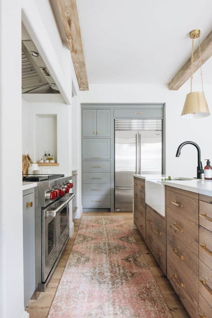
An error in the kitchen design can turn your culinary skills into chaos. It leads to poor workflow inside the kitchen. The kitchen layout also determines how much storage space you can have. You don’t get to pick the kitchen layout; it’s already there.
But strategically placing the hob, sink, and refrigerator will allow you to move around comfortably. Ideally, these kitchen elements– sink, hob, and refrigerator- should be placed close to each other in a triangular pattern, not more than three feet apart. It’s called the Kitchen-work-triangle, a popular kitchen concept that works the best in most cases.
Mistake 2: Underestimating the storage needs
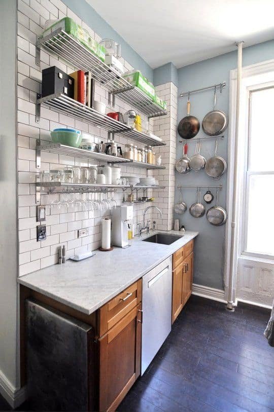
You can skillfully design your kitchen with space-saving storage. But are you sure this will be sufficient for your use? Underestimating the kitchen storage needs means you will store things on your countertop occupying the working space. If you have run out of storage, you can install wall-mountable racks or glass shelves. Kitchen pegboards are also popular inexpensive choices.
Mistake 3: Trying to fit everything in
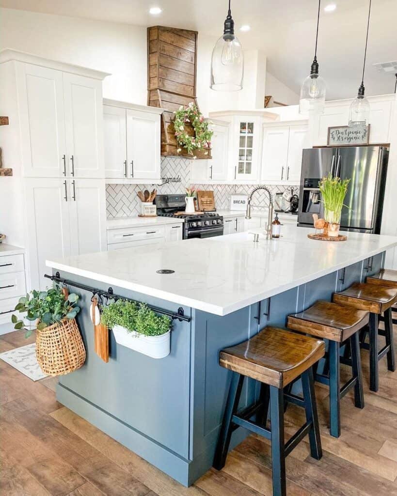
It might be too tempting to have all the latest kitchen units when you design your kitchen of your dreams. But it can blow up your budget. Once you install items without considering the space, there’s no way you can undo the blunder. So, whether it’s having the largest double-door refrigerator or the latest kitchen island, make sure it doesn’t interfere with your workflow. When placing appliances and kitchen units opposite one another, allow 4 feet of space between them.
Mistake 4: Eliminating the kitchen chimney

No matter how many windows or exhausts you have, they cannot replace the function of a kitchen chimney. Kitchen chimneys are an essential part of every modular kitchen as it sucks up all the oil, smokes and fumes to keep the kitchen fresh and eliminate indoor pollutants.
Without one, your kitchen walls, cabinets, and appliances will soon turn yellowish. Invest in a good kitchen chimney to avoid one of the costliest kitchen mistakes. If you don’t have windows buy a better one. Have an open kitchen? Buy the best possible kitchen chimney you can afford.
Mistake 5: Picking poor materials for the cabinetry

Mistake 6: Get in the way of thoroughfares

Sometimes the kitchen is the thoroughfare to another room; in that case, you have to make sure the kitchen cabinetry or the refrigerator doesn’t block the passage to the room. If you have a narrow kitchen design, opt for pocket sliding doors that hide inside the wall and utilize the space over the door by installing the cabinetry. It’s a smart way to make tight spots more accessible.
Mistake 7: Not planning for the lights

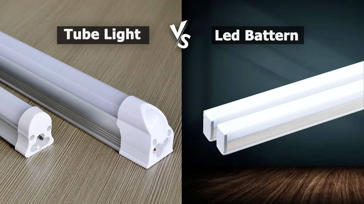
Another common kitchen mistake is not planning for the lighting beforehand. One who has to cook in a kitchen with just one tube light understands the importance of adequate light in a kitchen. You will need task lighting over the countertop where you prepare mills. Usually, chimneys have an in-built light that enlightens this area. You might also need lights under the cabinets and statement lights if you plan for an open kitchen.
Mistake 8: Cutting down on the worktop space
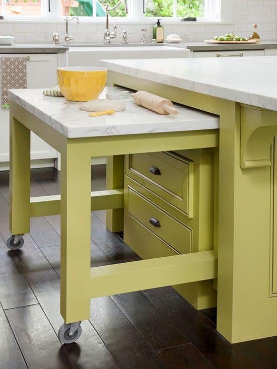
All the kitchen activities happen over the worktop, including the kitchen appliances that you place on the countertop. The worktop may require more space than you think. A kitchen countertop that is less than a meter does not support practical kitchen interior design. To extend your worktop area, you can place a movable rack beside it, install open shelves on the backsplash, install a foldable table, or buy shelf risers.
Mistake 9: Going with the trend
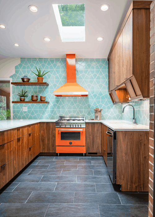
Although it’s not exactly a kitchen design mistake, going too trendy might not be a wise investment for the kitchen. Trendy kitchen units, colors, and patterns are not timeless. And most people don’t think of kitchen renovation any time before 10 to 15 years. If you want to embrace the latest colors and trends, include them in small accessories like lamps, wall paintings, wall hangings, and items that you can easily change if your taste changes.
Mistake 10: Not including appliances in the plan

When you start with the kitchen layout, you don’t give much importance to the kitchen appliances. They come at the last. And that’s when all the confusion starts, where to place what! Consider installing the kitchen units around the kitchen appliances rather than the opposite. This way you can build a seamless kitchen interior design that smartly accommodates all the kitchen essentials and is space-saving too.
Mistake 11: Not installing enough power points
Have you thought of it? It’s nearly impossible to install additional power outlets once you have finished with your kitchen design.
We not only need power output for mostly used appliances like the mixer, toaster, but we also need power socks for the lesser-used items like the blender, juicer. A power socket for charging your smartphones would also be very handy. Consider installing at least 4 power units so that you don’t have to switch between plugin and plug out.
On an ending note:
Dreaming of a vogue-worthy kitchen design that is not practical is a waste of money. A kitchen is a busy place, and you have to plan everything according to the space available.
A kitchen that hinders the workflow is the worst type of kitchen.
Consider leaving at least four feet gap between the hob and the sink. Think about increasing the functionality of your kitchen by storing spices near the cooking hob and allot a designated space for the pantry.
Think of a timeless kitchen that is smart, functional, and sticky to a realistic plan that benefits the user experience.

